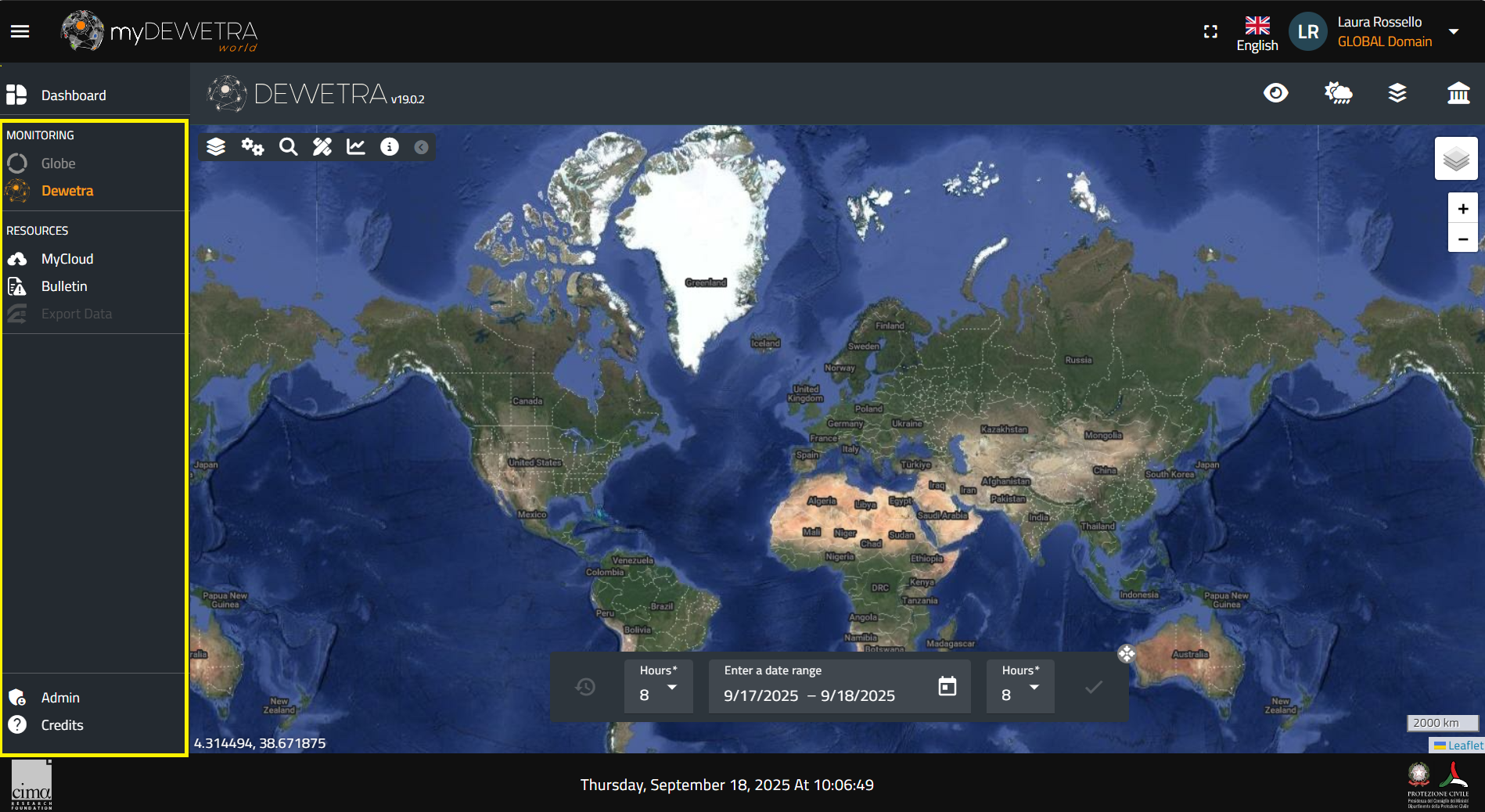
[Home] - [Access to the platform] - [User Interface] - [Observations] - [Forecast Models] - [Static Layers] - [Events]
In this section, users will learn how to navigate the platform to read and access the information provided through the different models, layers, and sources. This section is dedicated to giving users a deeper understanding of the following features:
- Window Mode
- Switch Language
- Control Map
- Toolbar
- Calendar Display
- Layer List
- Additional Tools
¶ Window Mode
The window mode allows users to switch from a full view of the myDEWETRA3 application to a reduced view, where the display shows the language and user details in the upper right corner and the list of available applications on the left. The window mode button is located in the upper right corner, next to the language selection.

By pressing the window mode, a panel will appear on the left showing the list of available monitoring and resource applications, along with the admin profile assigned to the user.
¶ Switch Language
At present, DewetraWorld is offered in several languages:
- English
- French
- Spanish
- Portuguese
- Albanian
- Greek
- Ethiopian
- Italian (default)
To change the default settings, click on the flag displayed next to your account in the top right corner. A menu with the list of all the available languages will pop up (see figure below). Please note that the list varies depending on the user's permissions.
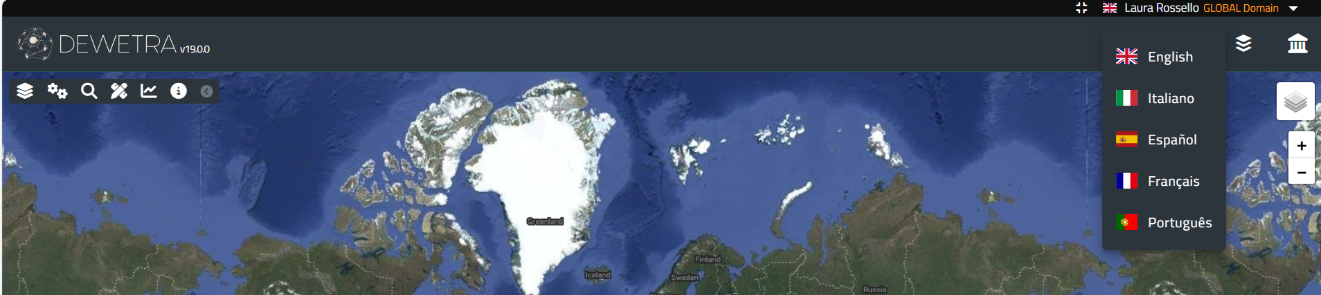
Left-click on the flag corresponding to the language you want to set: the system will update all the labels and all the menu accordingly.
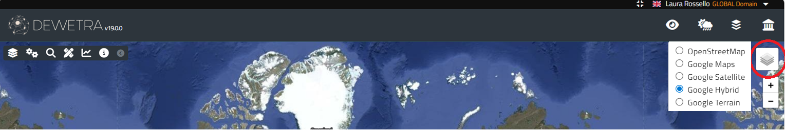
¶ Control Map
The Control Map of the application is managed by the open source Java script library Leaflet. The control is instantiated as the system is started, using the Google Hybrid map provided by Google-Maps services as the background layer.
The available background maps are:
- Google Map: consists of the world political map, toponyms are shown with respect to the zoom level;
- Google Satellite: consists of the world's physical map obtained from the composition of high-resolution satellite images;
- Google Terrain: world physical map in which are graphically displayed mountain ranges, lakes, rivers, depressions, et c.
- Google Hybrid (default): represents the combination of the two aforementioned maps.
In addition to these main options, the user can upload every background map released by open source consortia (eg., OpenStreetMap) such as Standard, Cycle Map, Transport Map, MapQuestOpen, Humanitarian, et c.
The user can select the background map by moving the cursor on the action button located in the upper right of the screen, shown in the following figure:
It is possible to pan the map by clicking the left mouse button and dragging it in the desired direction. The zoom level may be controlled:
- using the mouse wheel (scroll forward: increases the level of zoom / scroll back: decreases the zoom level)
- by holding down the SHIFT key on the keyboard and drawing a rectangle with the mouse, holding the left mouse button clicked. In this way, the zoom will be related to the selected area
- by the combination of CTRL and + buttons (Zoom In) or CTRL and - (Zoom Out)
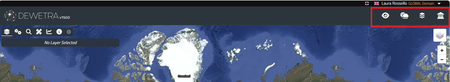
¶ Toolbar
The Toolbar contains many action buttons, depending on the user's profile, like the following:
- Observations: is the section dedicated ot observational data and diagnostic models
- Forecast Models: lists all the available forecast systems (numerical weather prediction models, hydrological models, landslide susceptibility models;
- Static Layers: provides all the information needed to design a comprehensive risk scenario, such as the exposures or the hazard maps
- Events: is the category that groups all the layers concerning disasters happened in the past, such as floods, earthquakes, fires, et c.
The complete description of all the functionalities and layers that can be found in the system is developed in the dedicated sessions, Observations, Forecast Models, Static Layers, Events.
¶ Calendar Display
The time range of the data displayed by the system is shown in the Calendar Display. Within this tool users may find:
- the starting date of the time range selected by the users and the button to set hours
- the end date of the time range selected by the users and the button to set hours
- the current date and hour at the bottom
By default, the application will set the limits of the time range between "now" (i.e., current date and UTC time) and 24 hours before (which is assumed as the beginning of the period of the analysis).
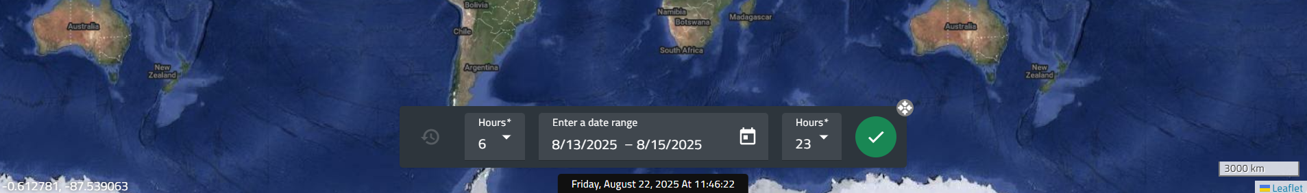
In the display there are several action buttons:
- the calendar icons allow the users to modify, respectively, the starting date and the end of the time range. By clicking on the buttons, you can set both start and end dates (day, month and year) of any time window into the past and view the data available at that time (the so-called deferred time mode)
- the hours buttons allow to set the hours referred to the start and end dates
- the clock-shaped icon on the left side of the bar sets back the dates of beginning and end of the time range to the default mode (current date)
¶ Layer List
Unlike the previous version of Dewetra, the Layer List is dynamically created whenever the user loads a static and / or dynamic layer. Everytime a layer is selected by the user, the Layer List -containing the layer name and the available options for it- is displayed in the top left corner.
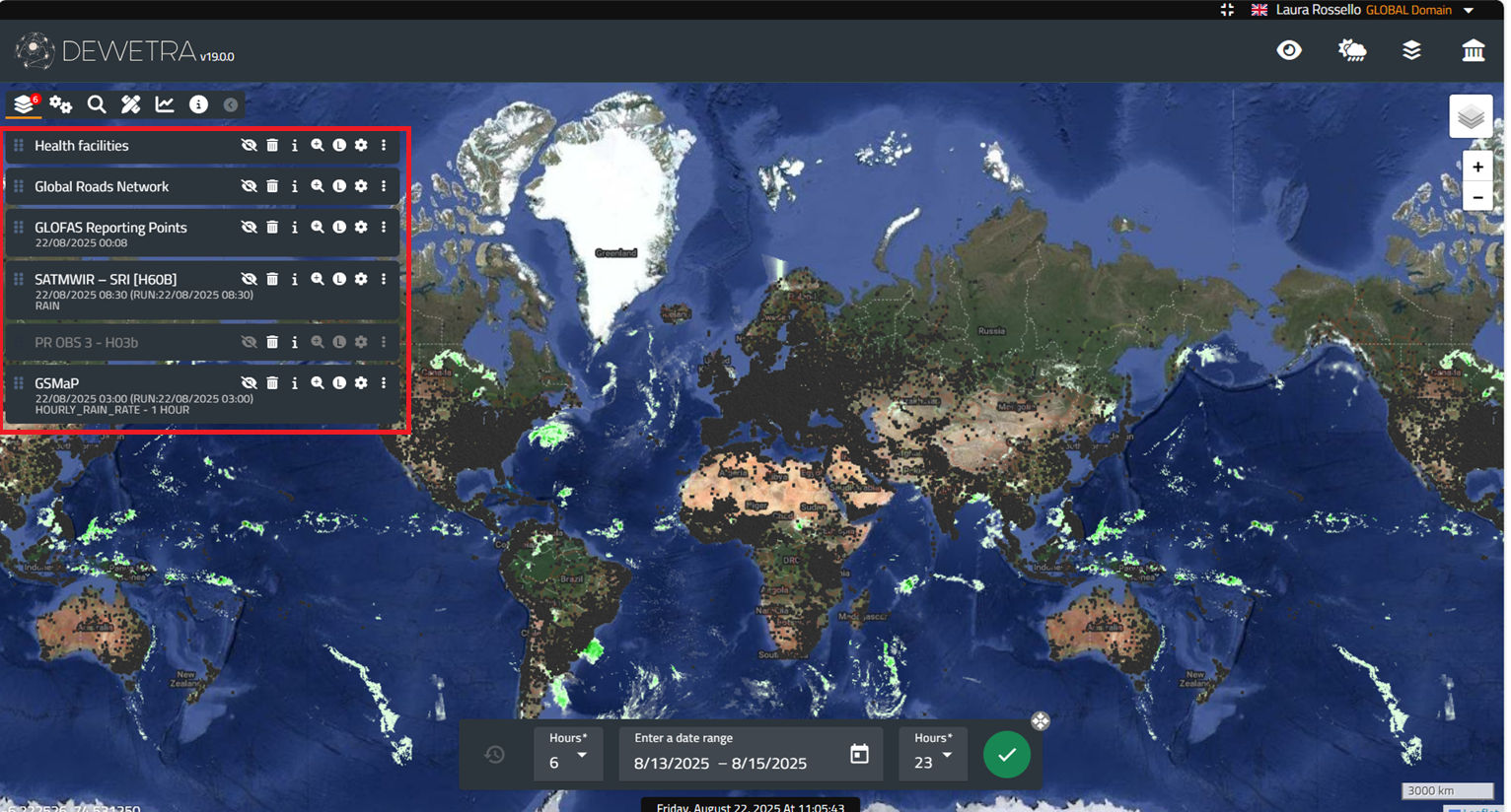
Each element of the list can be turned on or off and therefore displayed or hidden on the map, by acting on the control menu next to the name. Its relative position on the list corresponds to the position of the layer on the map: usually, the latter layer that has been loaded overlaps the former ones. Anyway, users may change the priority of a layer, by left-clicking on the layer icon on the left of the name in the Layer List and dragging it up or down.
The available features for the dynamic layers (Observations and Forecast), for the Static Layers and for the Events are described in the dedicated sections.
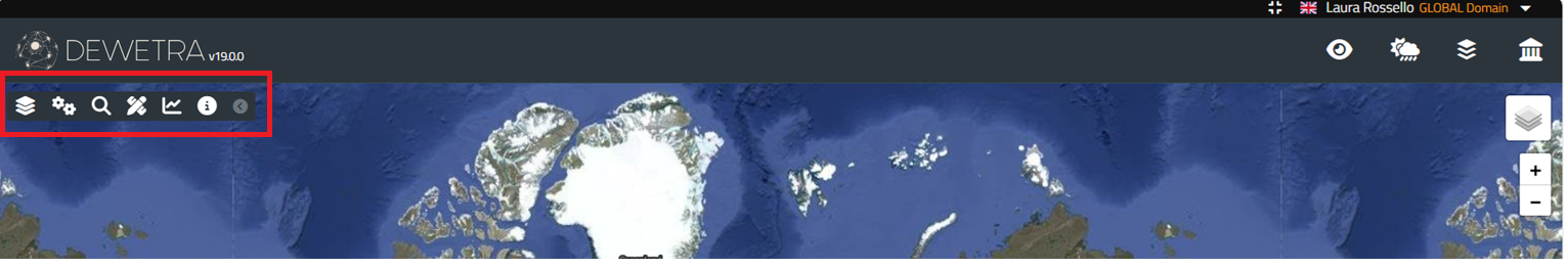
¶ Additional Tools
The Additional Tools are placed in the upper left of the dashboard, immediately after the layer list icon and include in order, from left to right, More Tools, Search, Measurements, Time Series and Info.
¶ More Tools
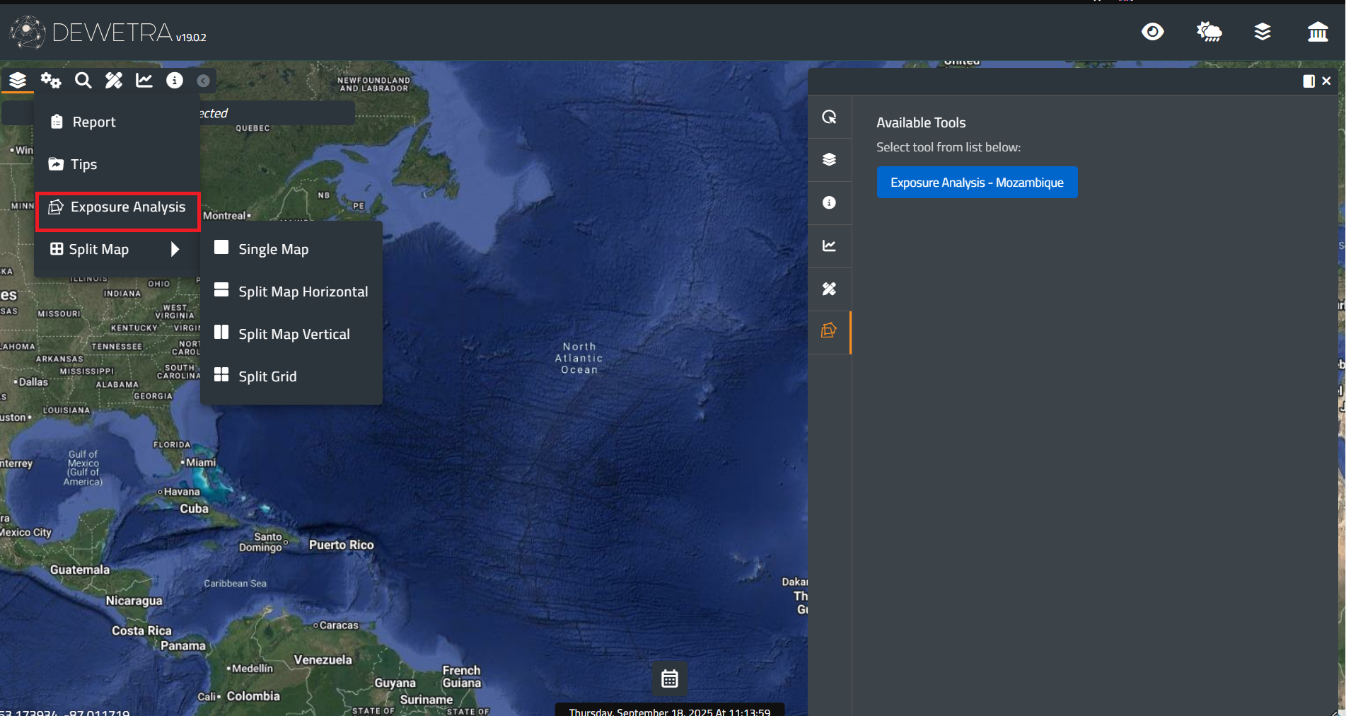
More Tools enables some useful functions, such as Report, Tips, Exposure Analysis and Split Map
¶ Report
The Report tool allows users to develop a report with the active window containing one or more of the layers previously loaded.
Before launching the application, the user must load the layer/layers that they want to include in the report.
To start the Report tool, click on its icon located in the toolbar, as shown in the figure below:
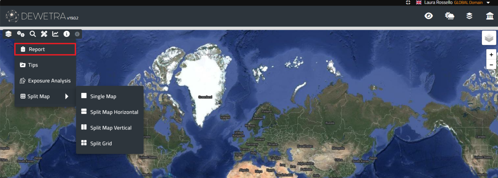
By pressing the Report tool, a new window will appear where the user can develop the report.
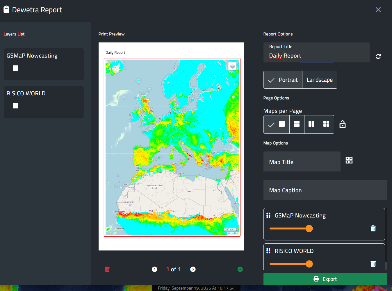
First, the user selects the layers to be included in the report from the right side of the window (this step must be repeated for each page). Next, the map extent and scale can be adjusted using the zoom in and zoom out tools, with the current scale displayed at the bottom right of the map. Pages may also be added or removed with the buttons located below the image. On the right panel, the user can define a report title, choose the page orientation (portrait or landscape), specify the number of maps per page, assign individual titles, and provide short descriptive captions. Finally, the slider allows adjustment of the map opacity across all pages.
Once the user has defined all the details, the report can be finalized and downloaded in pdf format by pressing the Export button.
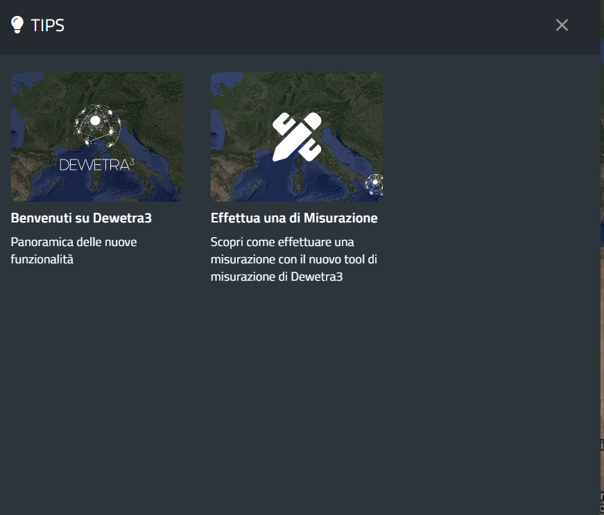
¶ Tips
To start the Tips tool, click on its icon located in the toolbar, as shown in the figure below:
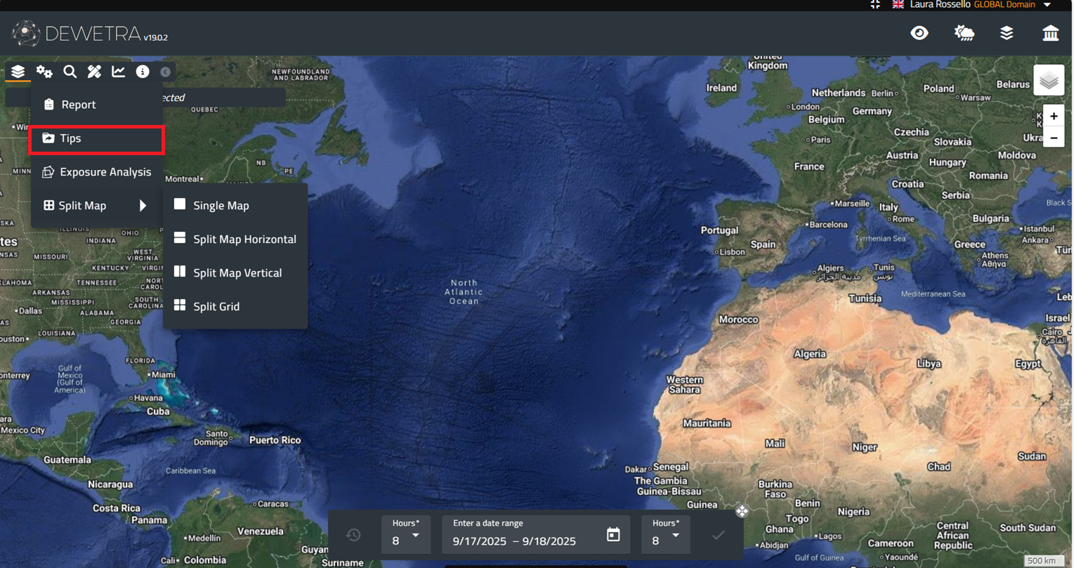
A new window will appear with some short presentations on specific topics related to the platform.
¶ Exposure Analysis
A comprehensive risk scenario can be created by the user through the Exposure Analysis dashboard that will appear on the right side of the screen after pressing the Exposure Analysis button (see figure below). The list of available Exposure Analysis tools depends on the user profile.
¶ Exposures
The first step is to select the exposures to be analyzed from the list of available layers. This list varies depending on the user’s settings, but generally includes:
The user is allowed to pick without restrictions as many layers as desired by selecting them. The figure below shows an example of a list of layers that may be available. Once selected, the layers will appear highlighted and will be loaded and displayed on the platform:

¶ AOI
By pressing the Next button, the following step becomes available. This involves drawing an Area of Interest (AOI) to perform the exposure analysis. After clicking the Draw an AOI button, the user must left-click on the map to set the starting point of the polygon. To complete the AOI, the last point must coincide with the first one (i.e., the user must click again on the initial point).
Alternatively, an AOI can be uploaded directly to the platform as a shapefile. The shapefile must be properly formatted and provided in EPSG:4326. If multiple polygons are included, only the first polygon in the shapefile will be considered. The shapefile files must be compressed into a .zip archive, and the shapefile must be placed at the root level of the archive, not inside any subfolder. The archive can then be uploaded by clicking Upload AOI.
It is also possible to save the AOI for future use or sharing as a shapefile compressed in a .zip archive by clicking Save AOI.
AOI type refers to the potential use of flood areas or preload areas to perform the analysis.
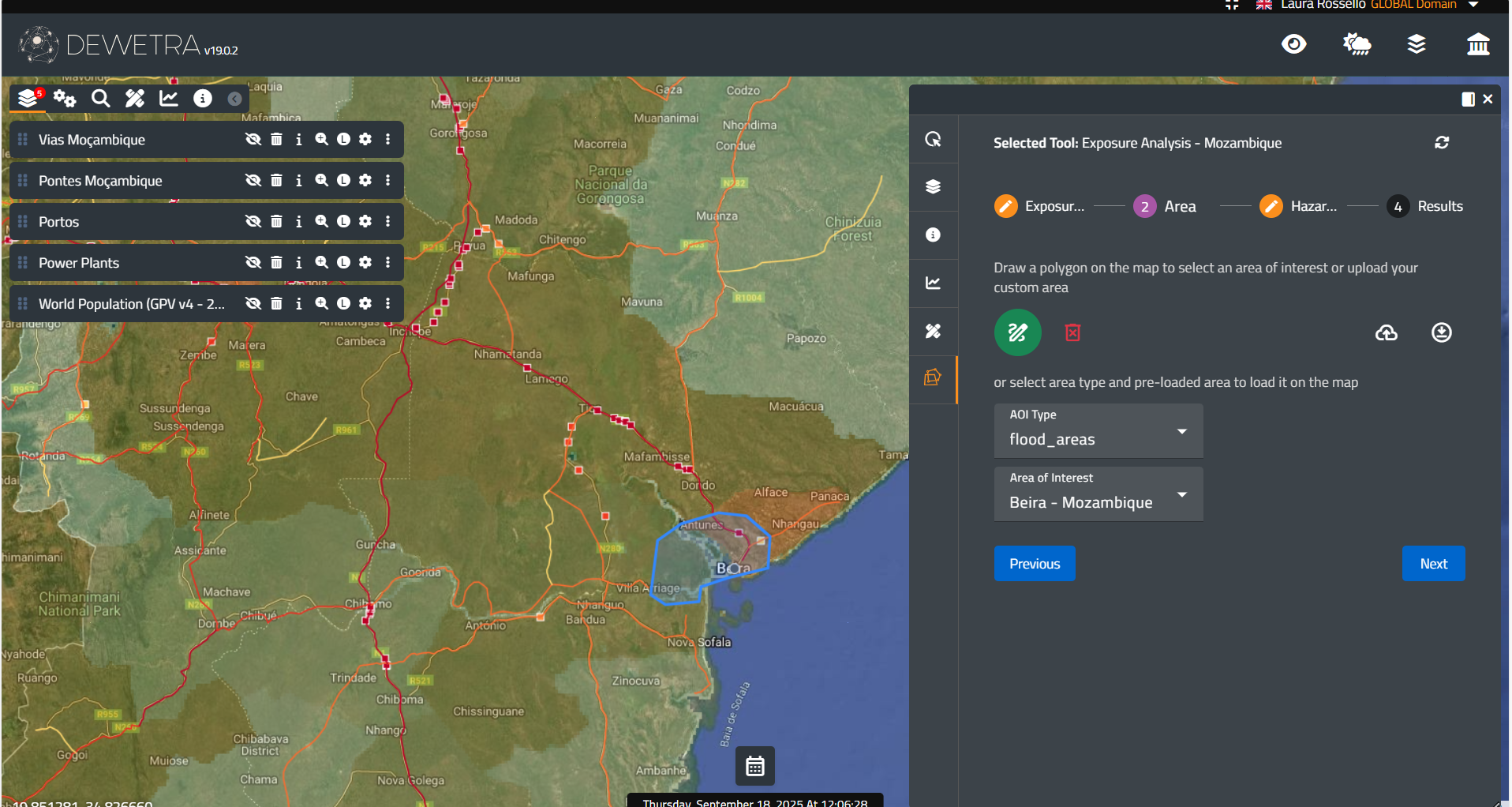
Please note that tha maximum extent of the AOI is set to 10,000km2
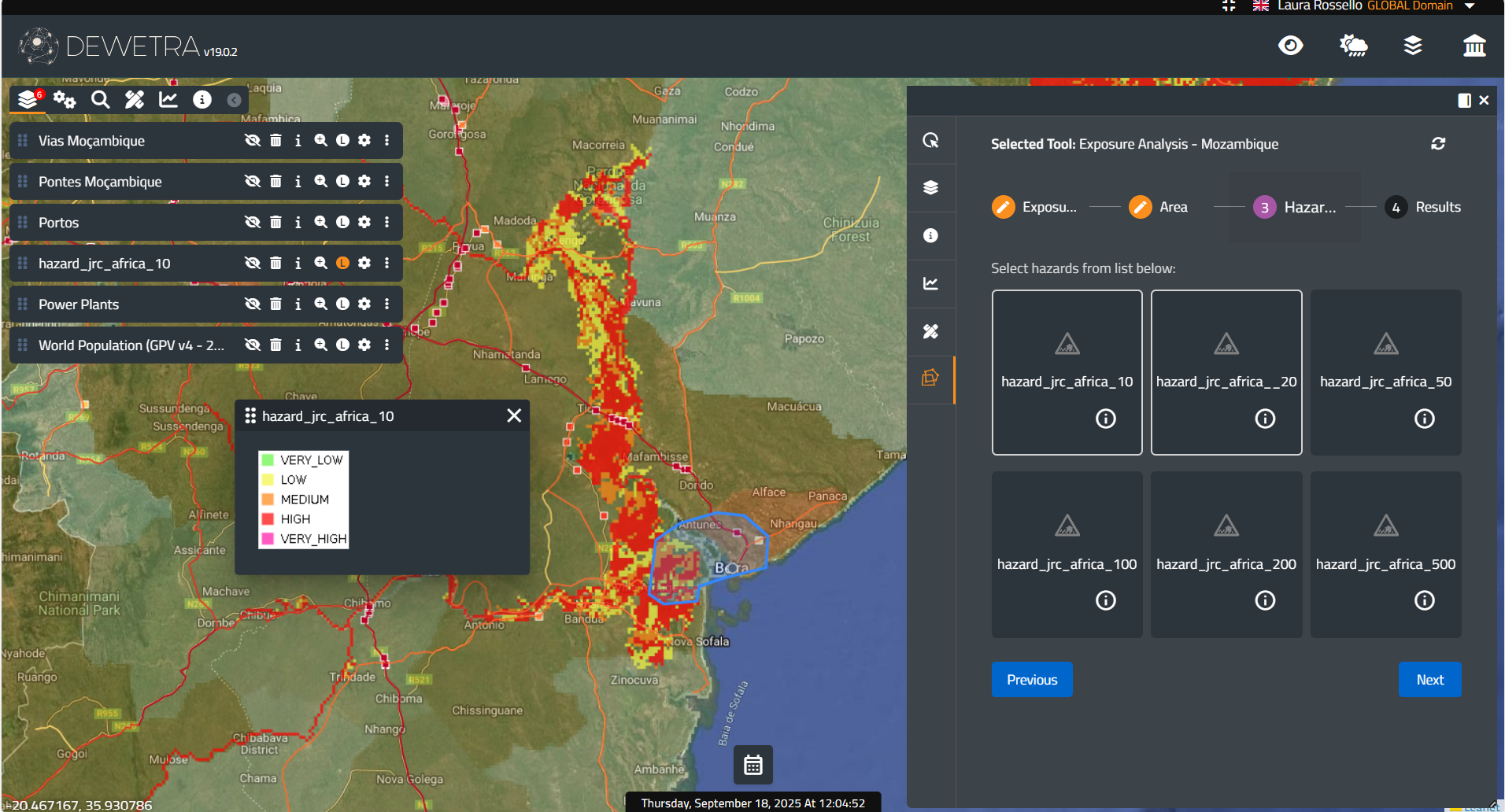
¶ Hazard maps
Users must decide whether to use hazard maps for the analysis. Doing so refines the results by providing a list of exposures that fall within different hazard categories, such as low, medium, or high. The figure below shows the selection of a hazard map: once selected, the map will be highlighted and loaded into the platform and made available in the layer list, along with the previously chosen exposure layers.
¶ Risk scenario
Once the selections are made, the user can press Next to view the results of the exposures within the AOI. A list of the analyzed exposures will appear, and for each layer the system will display related information, such as the number of people or specific assets located in different hazard areas, as shown in the figure below.
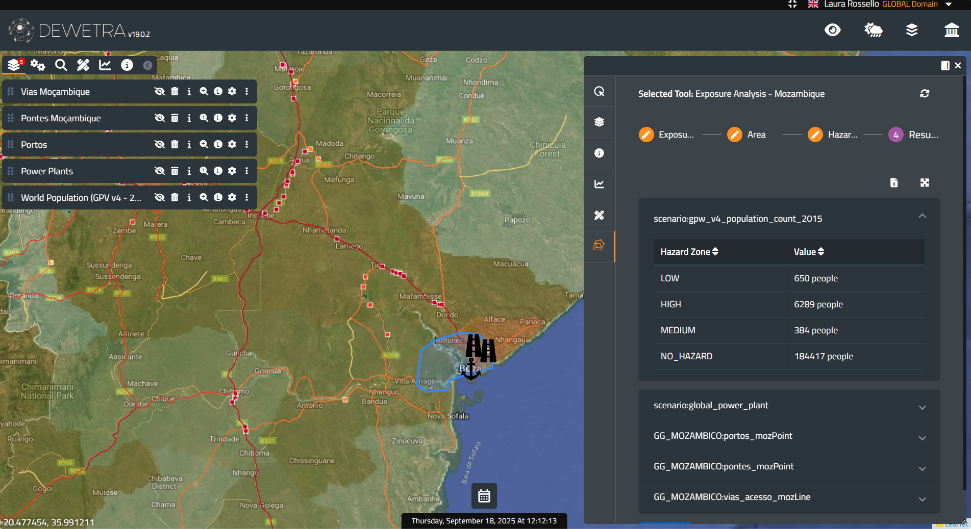
The system highlights the position of an asset on the map when the cursor hovers over its name in the list.
The results might be downloaded in .xlsx format by clicking on the button Download .xlsx.
If the user is not satisfied with the results, the scenario can be modified by navigate back to each of the previous steps:
- selecting more/different exposures
- drawing or uploading a new AOI
- selecting different hazard maps to perform the analysis
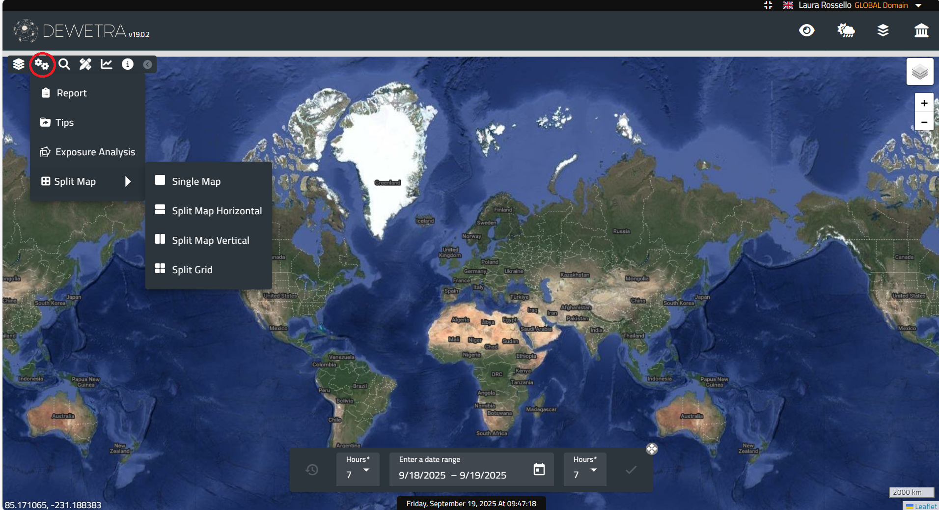
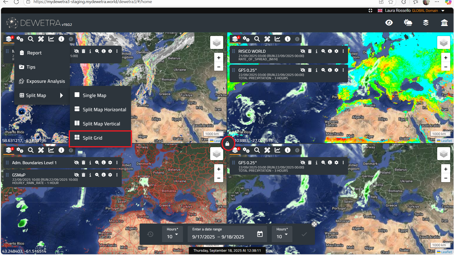
¶ Split Map
The Split Map feature allows users to divide the screen into 2 or 4 sections, each of which can display different layers simultaneously. To load layers into the maps, users must drag them by clicking on the six-dot icon to the left of the layer name. The map extents can either vary independently or be fixed to the same view by clicking the lock icon at the center of the screen.
¶ Magic Search
Magic Search is a tool that allows users to search for any element displayed on the platform. The searchable elements may include observations, forecasts, static layers, as well as all toponyms available in the background Google Map layers.
By selecting the button, the user can either type a search term or choose from the list of available layers. When a name is entered, the system returns results divided into Geographical Search and Layer Search categories (see the figure below for an example).

¶ Measurement
The Measurement button allows users to perform either linear or area measurements. Once selected, a window appears where the user can choose the desired option.
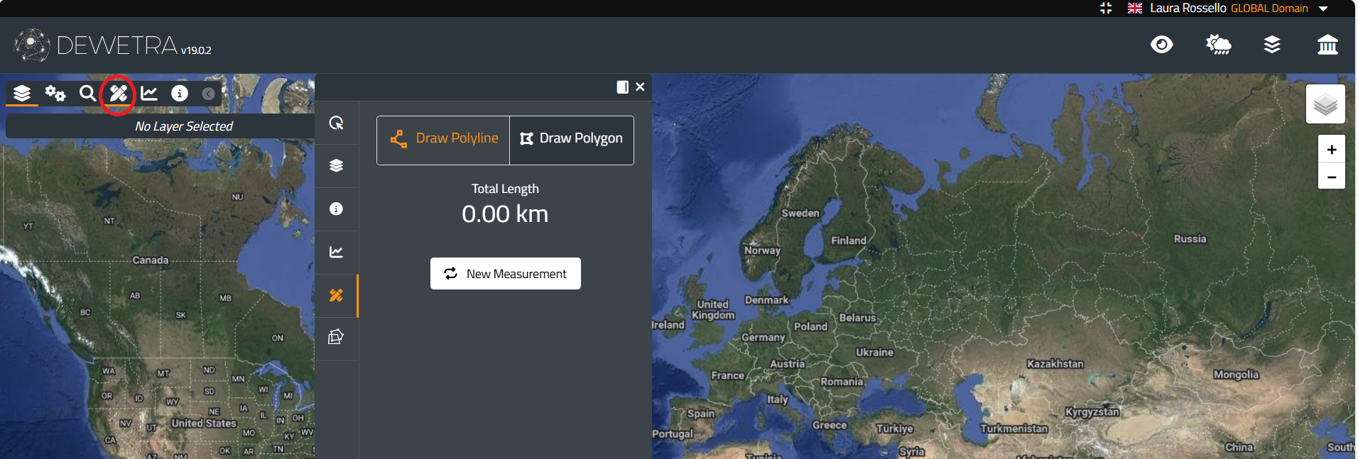
The user can draw a straight line or define the vertices of a polygon by left-clicking directly on the map. The system then provides instant information on the line’s length (in kilometers) and the polygon’s area (in square meters) within the window.
In the example, the window shows the length of the line drawn by the user and the area of the polygon.

To finish a measurement, double left-click in the case of a line. For an area, the user can either click again on the starting point or double-click at any point to complete the polygon (in this way, the last point on the map is automatically connected to the first).
To start a new measurement, click the New Measurement button. The system stores the list of measurements for each session. It is also possible to reload a line or polygon drawn in any session.
¶ Time Series
The Time Series tool allows the user to analyze how data from a specific variable or model changes over time. To use this function, the user must follow these steps:
- Load one or more layers onto the platform.
- Select the Time Series button. A new window will appear.
- Click on a point on the map where the temporal trend is to be analyzed.
The window will then display a graph with the results.
In the example below, the graph shows the model outputs over a 5-day time window, which represents the maximum forecast range of the model.
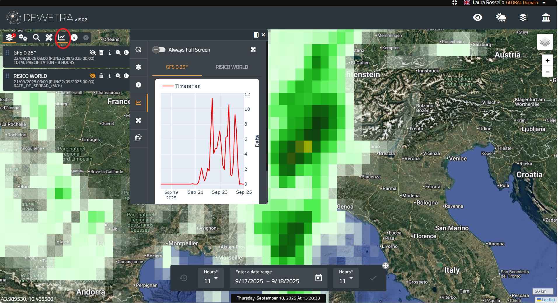
In the window, the user can select one of the layers loaded on the platform to analyze the time trend at a specific point.
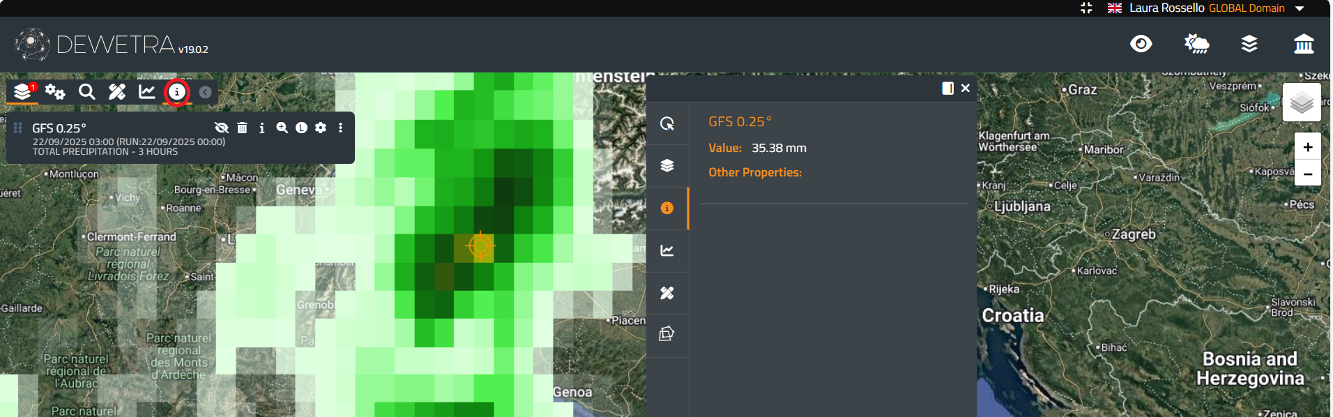
¶ Info
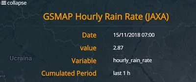
The Info tool is activated by left-clicking its dedicated icon i and allows the user to retrieve information at a specific point from any previously loaded layer.
In the example below, applying the Info tool to the rainfall layer opens a pop-up window in the the screen, displaying the rain depth at the selected point.
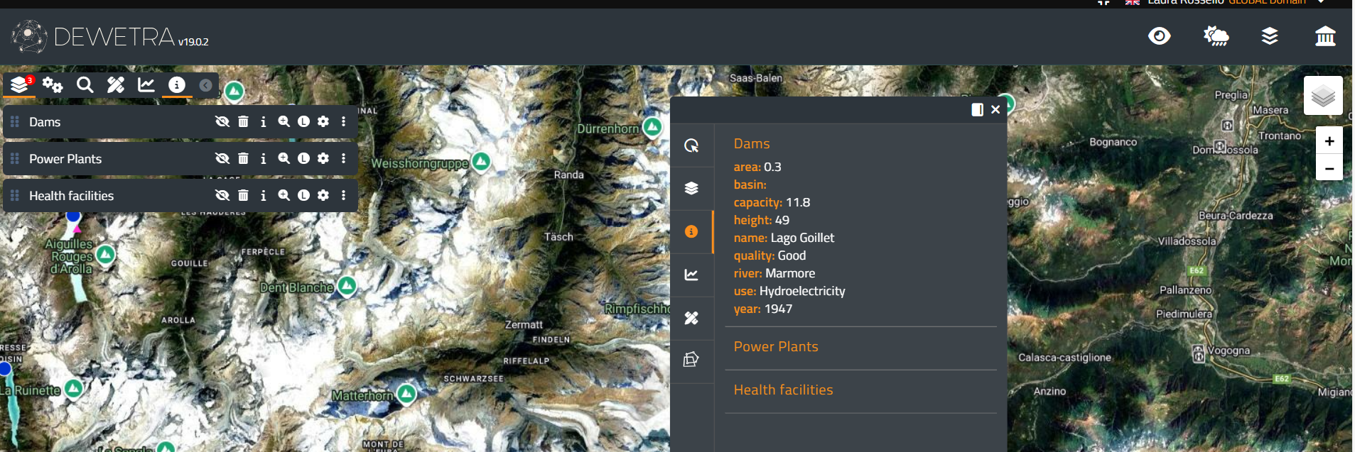
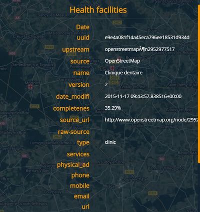
If the Info tool is applied to a static layer, the pop-up window displays all attributes available in the database for that layer. For example, the figure below shows the result when the user clicks on the Dams layer.
To disable the Info tool and return to navigation mode, left-click the i icon again.